Lead conversion is incredibly important for any business to succeed. Sure, you may have a steady roster of current customers – but how do you keep attracting new ones? How do you ensure you have a robust pipeline of leads ready to go?
In this blog, we’ll go over the ways you can take actionable steps to improve your lead conversion rates. By adding a clear call to action (CTA) to your assessments, you can ensure that your respondents know exactly how to take their next steps with you. With the new “button” tool that we’ve added to Agolix, it’s now easier than ever to add a call to action to your assessment results!
The Importance of CTAs in Lead Conversion
In the marketing world, CTAs are prompts that you probably see multiple times a day! They typically tell you as a user to take some specific action, like “Sign Up Here’ or ‘Buy Now!’ CTAs are an important part of your marketing strategy, asking leads to take one step further towards engaging (and then hopefully working) with you.
How should you best utilize a CTA? Incorporating them into your emails and on your website is one great starting point. Similarly, incorporating them into your assessments helps leads have a way to continue engaging with you and your content.
Why should you do this? Basic CTAs increase conversion rates on their own from around 1-2% to 5-10%. And, according to data from Hubspot, personalized CTAs perform up to 202% better than basic CTAs. Talk about an effective form of marketing and lead conversion!
Personalize your CTA button so that it matches your content and which next step your respondent should take with you. Add the CTA at the bottom of your in-browser results, your emailed results, and your PDF report, after you’ve provided your analysis of their responses. Your button might be titled “Book an appointment”, “Subscribe to my newsletter” or whatever makes the most sense for your business.
Common Issues with Current Assessments
You may be wondering why someone wouldn’t use a CTA in an assessment after that! The truth is, that many assessments lack CTAs, which hurts their effectiveness.
Ideally, once someone completes your assessment, they’re still interacting with you. How? You could direct them to:
- Visit a website
- Sign up for a newsletter
- Book a call
- Try out a product or service
- Visit your social media sites
and more!
By not having a CTA in your assessments, you lose out on the chance to keep leads engaged while they’re waiting for their results – and your follow-up. Think of CTAs like a built-in digital salesperson working for you – all the time! They’re there to gently nudge and guide leads through your businesses’ content, offerings, and information. You just need to decide how and where those leads should go!
Benefits of Including CTAs in Assessments
Including Call-to-Actions (CTAs) in assessments is crucial for guiding respondents to the next step, ensuring they don’t drop off after completing an assessment. CTAs act as a roadmap, directing respondents towards further engagement with content or your business. By clearly indicating what the respondent should do next, such as scheduling a consultation, downloading additional resources, or subscribing to a newsletter, CTAs keep the momentum going and prevent users from feeling lost or uncertain about the next steps.
Moreover, effective CTAs help respondents move forward with the assessment author, leading to higher engagement and conversion rates. When a respondent completes an assessment, they are already invested and curious about the results. A well-placed CTA can capitalize on this interest, encouraging them to take immediate action. This increases the likelihood of conversion – and deepening their relationship with you as the business owner!

How to Create Effective CTAs
This all sounds great – but how do you come up with effective CTAs?! Creating compelling CTAs requires careful consideration of language, design, and placement. Here are some helpful tips:
- Use action-oriented language: Words like “Download,” “Register,” “Get,” and “Join” prompt users to take immediate action
- Keep it concise and clear: The message should be short and to the point, ensuring there’s no confusion about what the user needs to do next
- Make the CTA button stand out: Use contrasting colors and strategic placement to ensure the CTA button is easily noticeable and clickable.
Don’t be afraid to practice with A/B testing to see which colors and text work best for you!
Some examples of effective CTAs for assessments are:
- “Get Your Free Assessment”
- “Download Your Personalized Report”
- “Schedule a Free Consultation”
Adding a CTA Button to Assessments
We’re excited to introduce a new feature that allows users to add a button to their assessments, enhancing the visibility and effectiveness of CTAs. This feature ensures that your CTA is not only prominent but also seamlessly integrated into your assessment.
Here is a step-by-step guide to adding and editing a button to the in-browser results delivered by your assessment:
- Access the assessment editor: Navigate to the assessment you want to edit and head to the “Results” tab
- Scroll down to the section titled “How respondents receive their results.” Click “Edit on-screen results”
- Usually, you want your CTA to appear at the bottom of your content. Go to the “Concluding Text” field and use the “Simple Button” tool to add your CTA:
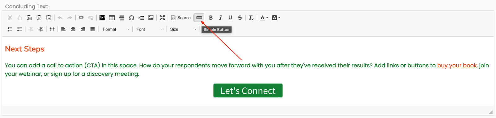
When you click that toolbar button, you’ll see a popup window where you can configure the text of the button, the URL it links to, its color, and other settings.
The “Simple Button” tool is available in all of the content editors throughout Agolix, making it easy to add a CTA or any other button to your emails and PDF reports as well.
Strategies for Encouraging Action
To ensure respondents take action after completing an assessment, there are some different strategies you can consider. First of all, align the CTA with the respondent’s journey. Where should they logically move to next? Help them get there!
You can tailor your CTA to meet the immediate needs and interests of your respondents. Would they want some helpful information that lives on your website while they wait for their assessment results? Make it easy for them to get to it with one click! Do you want them to read through some LinkedIn posts and learn more about you? Create a compelling button to go to your socials!
Some other actionable CTAs include the following:
- “Sign up for a free consultation”
- “Download our e-book”
- “Join our weekly webinar”
- “Follow us on LinkedIn for daily updates!”
These CTAs should offer clear, immediate value to the respondents, encouraging them to take the next step. When your CTA is truly aligned with a respondent’s needs, you’ll know. The click-through rate (CTR) will be steadily increasing, and that means your leads are more likely to convert. It’s a win-win!
For more information on creating effective CTAs, check out these external resources:
Summary
CTAs are a vital component of any assessment, significantly improving lead conversion by guiding respondents toward their next steps. By implementing the new button feature, you can enhance the effectiveness of your assessments with CTAs, ensuring they stand out and prompt action. Start incorporating CTAs into your assessments today to boost engagement and conversions. Get started here!