Create professional and informative graphs and charts for your assessment results with Agolix by Assessment Generator’s charting features. Adding charts to your results makes your report look more professional, easy to read, and easier to understand.
Type-Based Assessments
Type-based assessments contain multiple types or categories and generate a separate score for each. A well-chosen chart or graph can help to visualize and compare the scores between types.
You can select which type of chart to use when setting up your types. If you don’t want to show a chart at all, you can turn off the chart in the results setup for your on-screen, email, and PDF results.
There are four types of charts available:
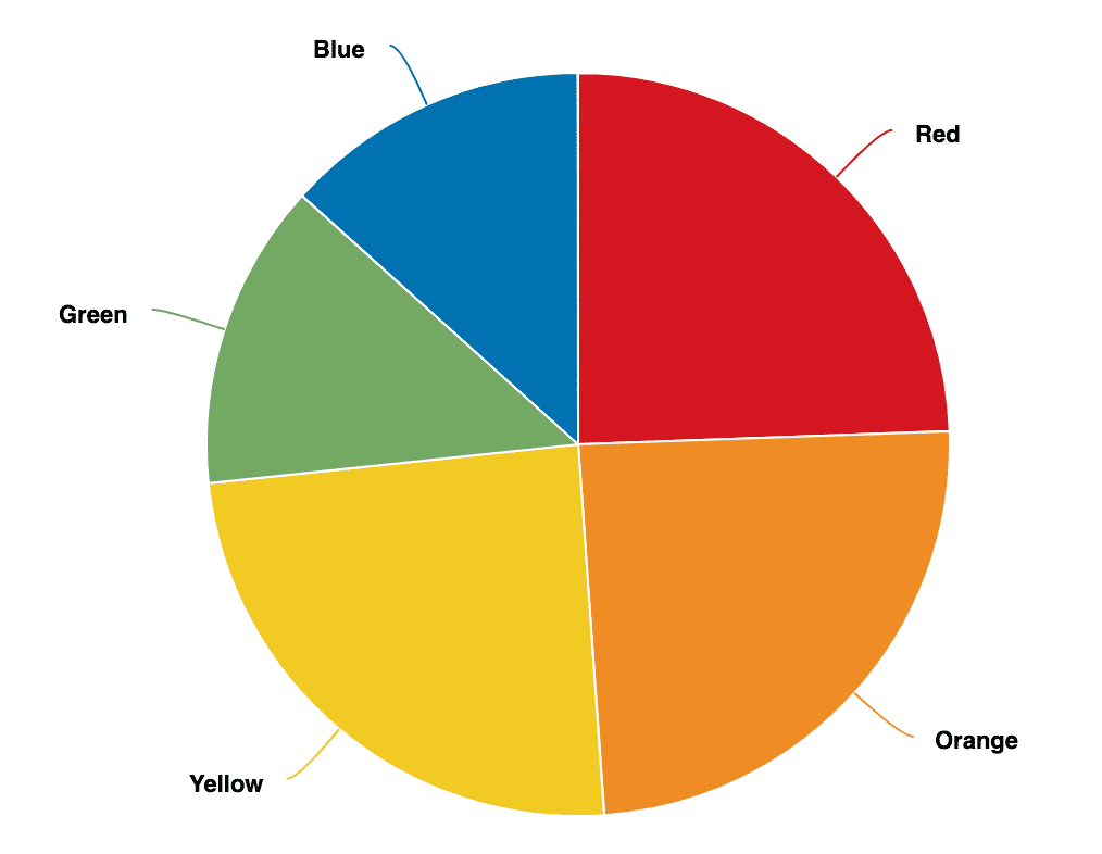
Pie Chart
A pie chart is a great way to depict how the score for each type contributes to the total score. The labels for each segment of the pie correspond to the names of your types.
You can define the colors for each segment using your brand colors or any colors you choose.
Radar Chart
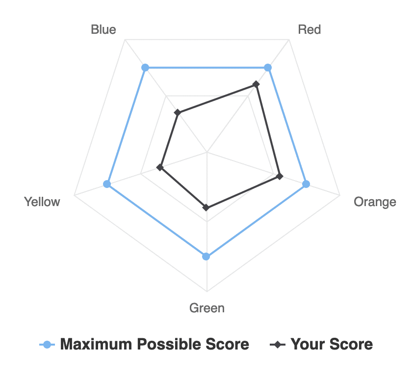
The radar chart is a great way to identify strengths and weaknesses. The chart includes two lines. The outer blue line shows the maximum possible score for each type while the inner black line shows the respondent’s actual score for the type.
Radar charts tend to look best for assessments with between 5-8 types and for assessments where each type has the same maximum possible score.
Radial Bar Chart
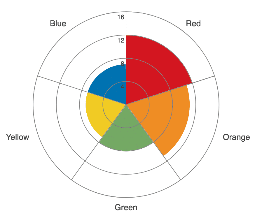
Our newest chart type provides a quick way to compare scores between types. The radial bar chart is similar to the bar chart but is laid out in a circular fashion. These types of charts work best in assessments with fewer than about 10 types.
Bar Chart
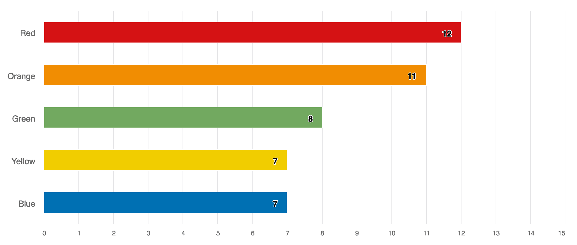
A bar chart offers a quick way to visualize how scores compare with each other. The x-axis of the chart extends to the maximum possible score across all types.
Bar charts are often the best choice for assessments that have a large number of types. The chart will automatically grow to accommodate all of the types you’ve defined in your assessment.
You can present the types in the order of the respondent’s scores (highest to lowest) as shown below or you can specify the order when setting up your assessment.
You can specify the bar colors individually or they can be all the same color. For both radial bar charts and bar charts, if you choose to score your assessment using a percentage, the chart will extend from 0 to 100.
Simple Assessments
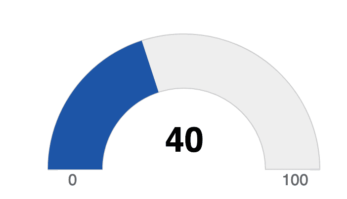
Although only a single score is reported for simple assessments, you can still provide a visualization of the score using a gauge chart. You can enable or disable this chart when setting up the results for your on-screen, email, and PDF results.
Whether you’re using a simple assessment or a type-based assessment, the addition of a chart can add visual interest to your reports and make it easier for respondents to interpret their results.
If you have unique charting needs for your assessment, please contact us at Agolix. We have the ability to create custom plugins to either modify our default charts or to create entirely different charts to meet your needs.


